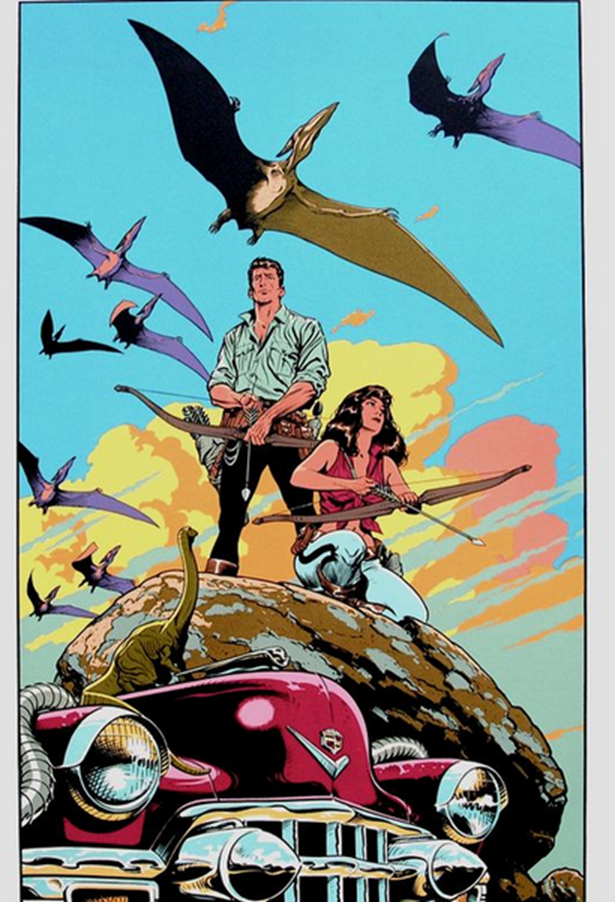
On Drawing Like Moebius:
Based on a Question from Tumblr
Hey thanks for the question! I'm a
complete amateur and Moebius is, in my estimation,
one of the most skilled visual artists of the last century so please take
everything I have to say with a grain of salt while I answer your question.
This all comes from my own experience and I am still learning.
First of all my main piece of advice
for anybody drawing anything: if you want to get good, assume that you know
nothing, start from the beginning, practice fundamentals, and draw every day, even
if it's just for like 15 minutes. No amount of art advice is worth anything if
you don't draw.
Now to address your question about
how to replicate a 'Moebius-like Quality,' I would
say what you need to do is study him very carefully.
When I
first started drawing seriously and getting super into Moebius
and all that I made the mistake of thinking 'Okay, this is just simple lines
and bright, mostly flat colors underneath.
Not too hard to replicate.' Which couldn't be further from
the truth. Moebius' art has this thing about
it where it can often appear really simple but you try to recreate it and you
find yourself hitting a wall. Let's look at an example:
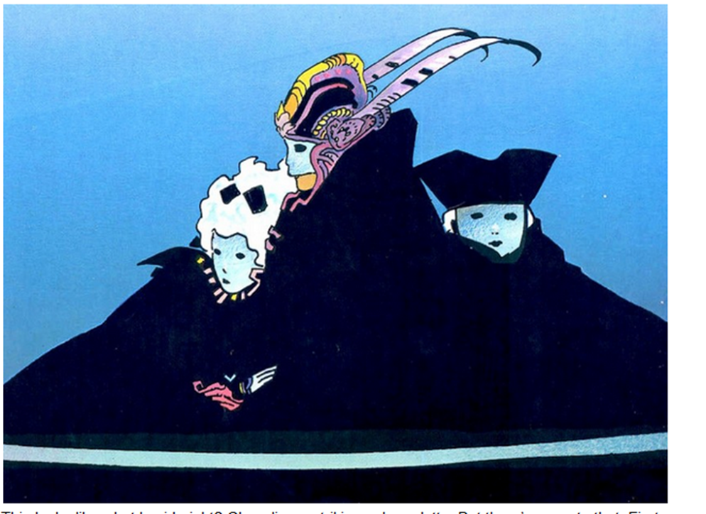
This looks like what I said, right?
Clean lines, striking color palette. But there's more to that. First of all,
the fact that the gigantic flat black shape at the bottom of the piece conveys
simultaneously the impression of the girl on the left leaning against the chest
of the central figure and the boy on right fading into the back of composition
while not containing any detail itself should clue you in to how much of a
master good o'l Gir is and
how much thought and knowledge had to go into designing this piece. There's
more.
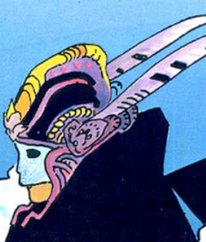
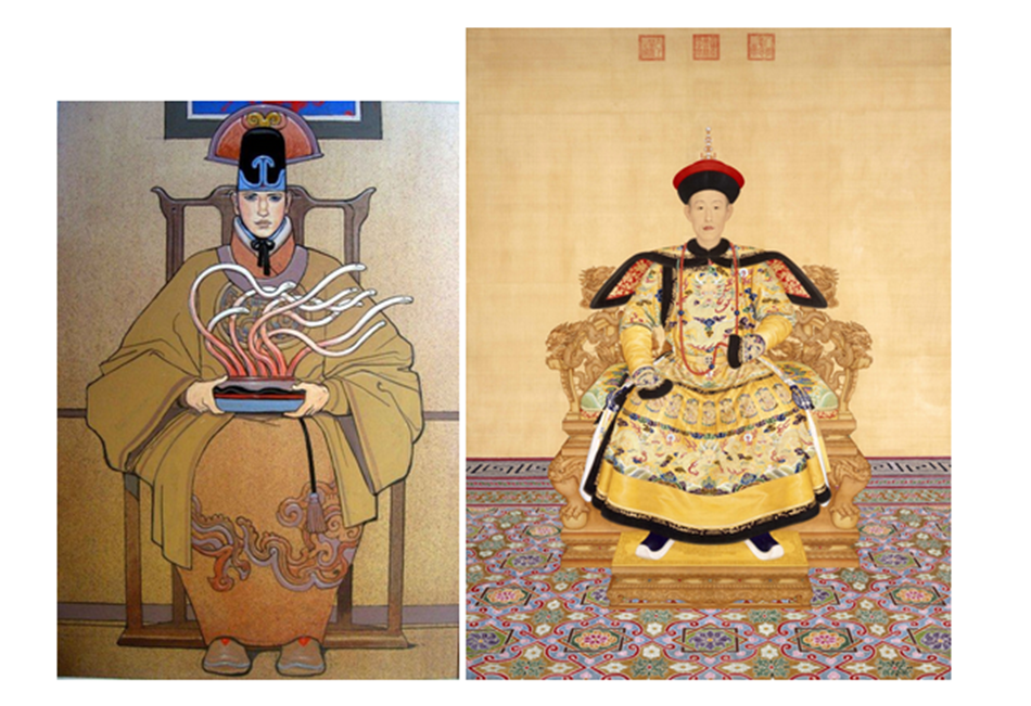
If we zoom in on the head we can
learn a bit. This is the focal point of the piece and, as such, this is where
all the detail is. Where lines are used sparingly throughout the rest of the
comp, here they provide an abundance of detail for the central figure's
elaborate headdress with contour lines defining the shape of the yellow crest
and other lines throughout intimating textile patterns. The colors are striking
but they're not just random bright colors.

There's the light blue of the
background, a smattering of desaturated purple/red
colors in the headdress, and the yellow of the crest. Let's look at a color
wheel:

You should notice that yellow is on
the opposite side of the wheel from the entire blue-purple section. Yellow
contrasts with blues and purples. Thus, just that tiny bit of yellow is enough
to make it totally pop out from the rest of the more desaturated
blues and purples in the piece. So, not just some random bright colors, but some
carefully thought out areas of low and high color contrast.
Let's look at another example:
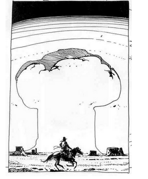
A small piece but so effective.
Notice how in the top, the horizontal lines begin super tightly packed and
spread to create a gradient from pack to white. Notice how the line weight
increases between the shadowed and light sides of the mushroom cloud to
brilliantly indicate a core shadow. Notice how the horse and rider are mostly
just black shapes- but they're composed in such a way that your mind knows
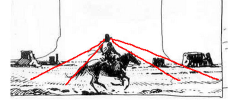
exactly what they represent. Notice how the hatching that creates the ground
texture also points towards the cowboy's head as a focal point.
Another one:
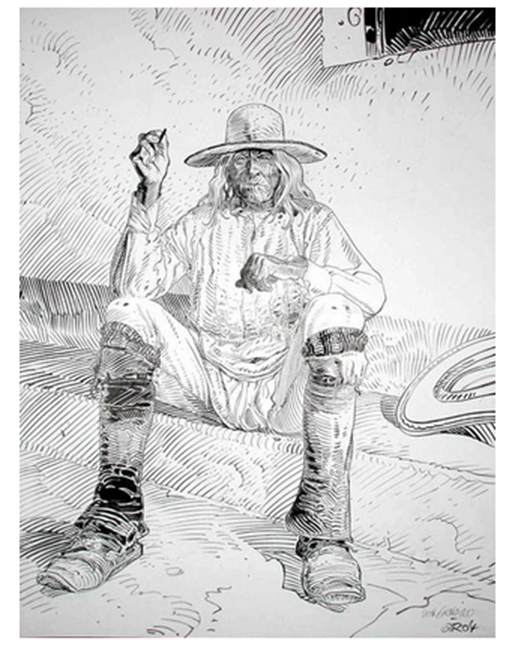
Look at the linework
on this. The way he varies the lineweights to
indicate changes in value. The way each line describes the form of the figure
and his clothes. How the lines create texture. No line here was put down by
chance- each one has a purpose and Moebius knew the
purpose of every mark he put on a paper.
So, I guess part one of my answer is you gotta really put the
work into being a good artist and use Moebius as your
guide. Get good with pens, be able to vary your lineweights,
be confident with all different kinds of hatching styles, etc. Read up on color
theory and see how Giraud applied it. Every new thing you learn, take that
knowledge and use it to study your favorite artists and see how they applied
it. That's how you learn.
There's a little more though and
this applies to the content of Moebius' art.
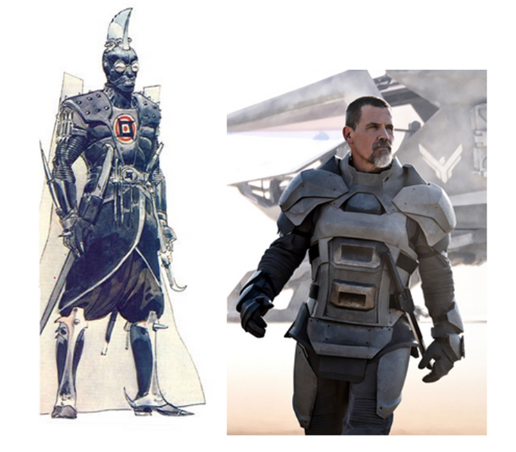
Here's a side-by-side comparison of
the Moebius' concept art for the unmade 1970's Dune
movie with a screenshot from the new Dune movie. What makes them different? As
bizarre as the Moebius design is, it feels a hundred
times more real to me than the armor pictured on the right. There's a specificity to it. Where the Moebius
design feels like the result of generations of tradition and culture resulting
in an outfit as elaborate, unconventional, and distinctive as that of an
Ottoman Janissary, a Landsknecht, or a Samurai, the image on the right looks
like a generic assemblage of armor plates with no history behind them.
As fantastic as Moebius'
work is, it definitely has a basis in the real world. I mean, he spent years
illustrating a gritty, down-to-earth cowboy comic. All his designs feel
distinct and specific and I would venture to say that a lot of that comes from
taking an interest in real world cultures and traditions.
I think this is true of all real
good science fiction and fantasy artists. They know how to take something from
the real world and twist it to their own ends.
I hope this answers your question
and helps you find joy in creating art. That's what it's all about.
For more reading, here's a William
Stout article on the subject: https://www.williamstout.com/news/journal/?p=3806
As a postscript, I'll include some
other artists that I think anyone who is a fan of Moebius
should check out.
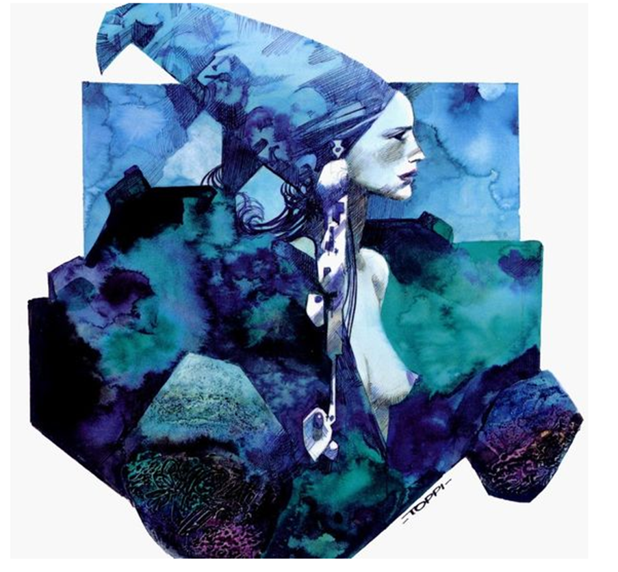
Sergio Toppi:
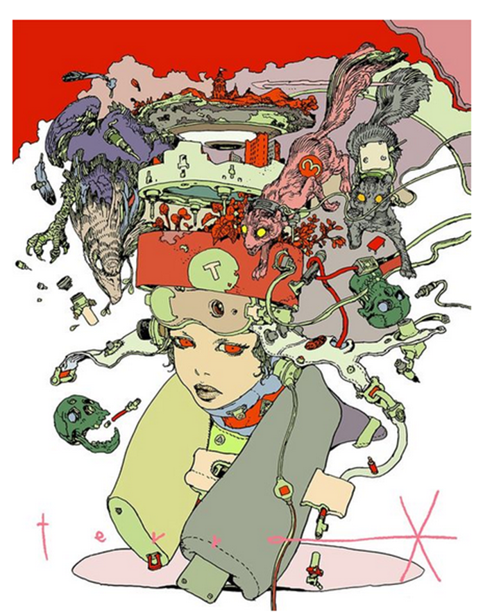
Katsuya Terada:
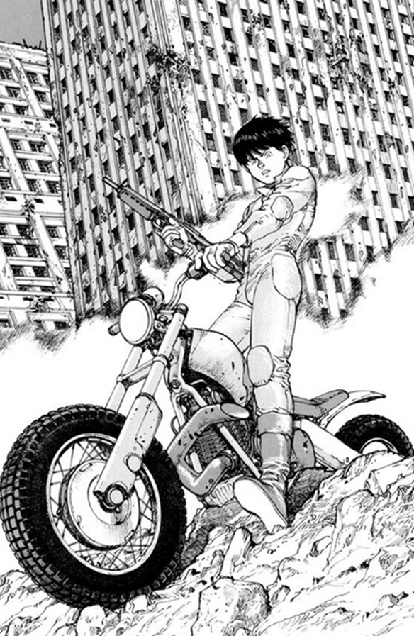
Katsuhiro Otomo:
Mark Schultz: